SIMPLIFYING COMPLEXITY IN AN E-COMMERCE WIDGET EDITOR
TL;DR
Designed a configurable interface for Distancify’s e-commerce review platform, focused on helping merchants customize how customer reviews are displayed on their websites. The project explored how to balance flexibility and usability in a feature-rich system through interaction design, system modeling, and iterative prototyping. The outcome was a high-fidelity interactive prototype featuring drag-and-drop interactions, contextual editing, progressive disclosure patterns, and scalable configuration workflows designed for both technical and non-technical users.
DISCOVER
Context
Distancify is a software company within e-commerce that develops Tycka, a platform that allows merchants to collect, moderate, and display customer reviews on their websites.
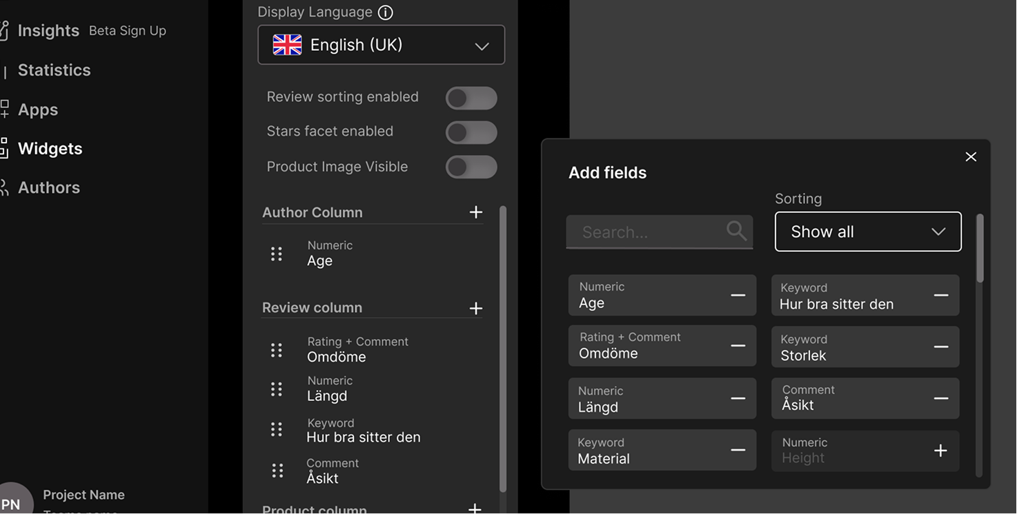
A core feature of Tycka is a widget editor, enabling users to customize how reviews appear on their site. At the start of the project, the configuration section of the widget editor had not yet been designed, which became the focus of this work.
The configuration system needed to handle several different tasks simultaneously:
- controlling what review data should be visible
- managing layout and hierarchy
- supporting multiple languages
- enabling sorting and filtering functionality
- configuring how reviews are presented on the final website
Problem Space
The widget editor needed to support a high level of flexibility, work for a very broad user base, and avoid overwhelming users with complexity.
The main challenge became balancing powerful configuration options with ease of use.
The system contains a large amount of configurable data within a relatively small interface area. Users need to understand relationships between fields, columns, languages, and review settings while still feeling in control of the interface.
Another challenge was that the system needed to support both technical and non-technical users. Some users might have experience with complex design tools, while others may only occasionally manage their webshop settings.
Target Users
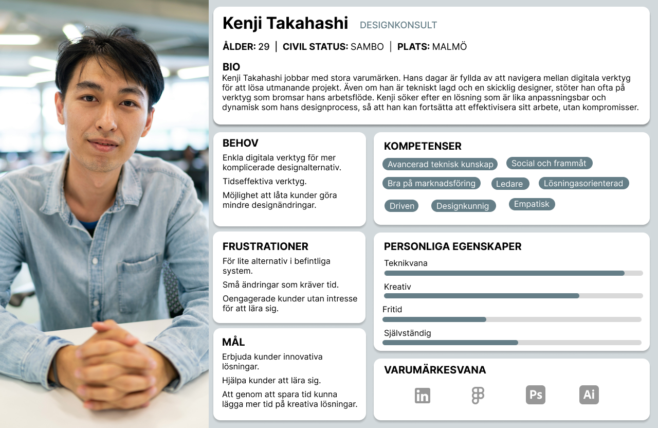
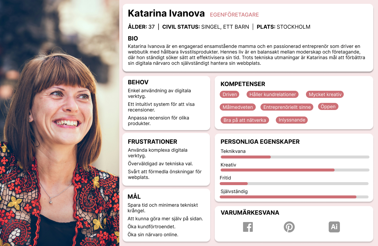
Because no specific target group was defined by Distancify, we worked with personas representing different types of users instead.
One persona represented a non-technical business owner with limited experience in digital tools, while another represented a more experienced in-house designer familiar with systems such as Figma and Photoshop.
The system contains a large amount of configurable data within a relatively small interface area. Users need to understand relationships between fields, columns, languages, and review settings while still feeling in control of the interface.
Another challenge was that the system needed to support both technical and non-technical users. Some users might have experience with complex design tools, while others may only occasionally manage their webshop settings.
The goal was to design a system that felt approachable for beginners while still powerful enough for advanced users.
DEFINE
Understanding the System
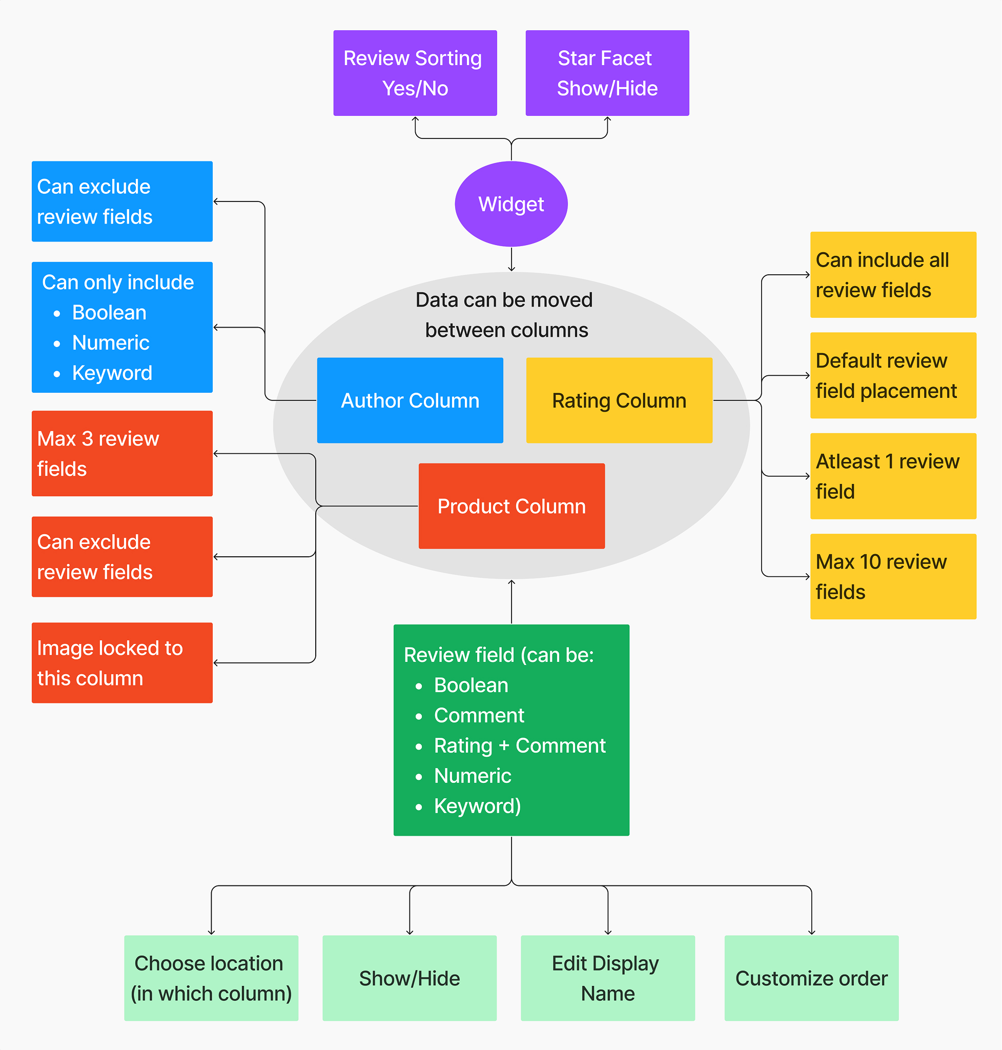
Based on technical documentation from Distancify, I created a conceptual model of the configuration system and a data flow diagram showing how review data moves through the platform. These artifacts helped clarify what data could be configured, what constraints existed how different parts of the system were connected, and which actions affected the final review widget.
For example, review data is collected earlier in the platform and then configured in this step before being displayed on the website. This meant the interface needed to reflect not only visual structure, but also the underlying logic of the system itself.

The conceptual model became especially important for understanding how different review fields could move between columns, what limitations existed, and how configuration choices would affect the final output.
Design Goals
The interface needed to:
- feel intuitive despite system complexity
- reduce cognitive load
- support different user skill levels
- make relationships between actions and outcomes understandable
- align visually with the existing Tycka platform
At the same time, it needed to remain scalable and flexible enough to support many different review structures and configurations.
DEVELOP
Iteration & Prototyping
The design evolved through multiple iterations, moving from early sketches to interactive high-fidelity prototypes. The process included early sketching and ideation, mid-fidelity prototyping in FigJam and high-fidelity prototyping aligned with Tycka’s design system.
The mid-fidelity phase became especially important for testing different ways of organizing complexity within the interface.
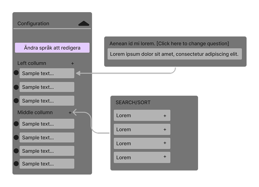
Using FigJam I explored how users could add and remove fields, reorder information, manage configuration settings, and understand relationships between columns and data. At this stage I also explored different ways of handling secondary interactions without cluttering the main interface. This eventually led to the use of modals and progressive disclosure patterns.

Designing for Complexity
One of the main challenges was designing for a feature-rich system within a limited space. To manage this complexity, several interaction patterns were introduced:
- modals for detailed editing
- drag-and-drop interactions for reordering
- clear grouping and hierarchy
- contextual feedback and warnings
For example:
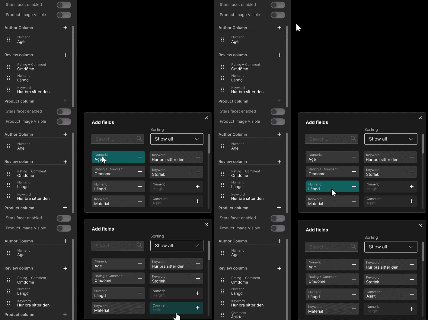
Adding fields
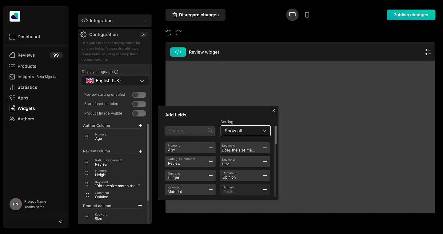
All available data can be added through a dedicated modal.
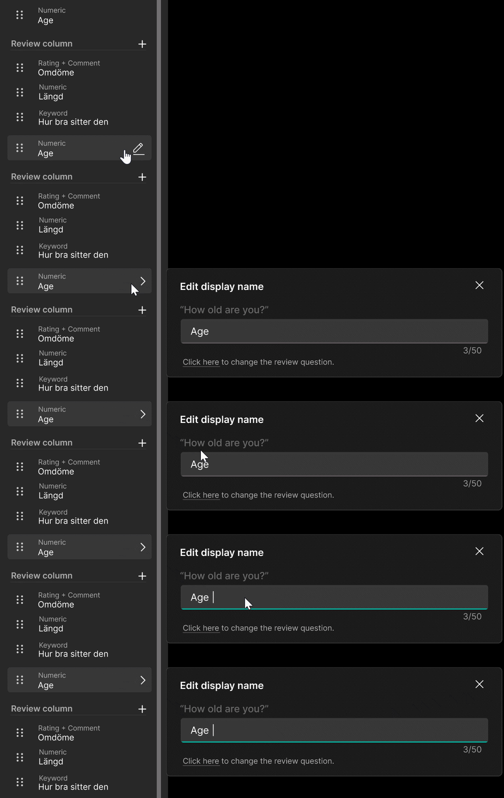
Editing fields
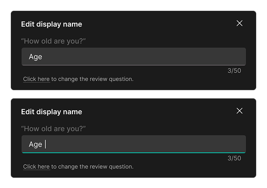
Each field can be renamed and adjusted through a focused editing modal.
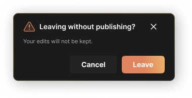
System feedback
Warnings and feedback communicate constraints and help prevent mistakes.
Interacton Design
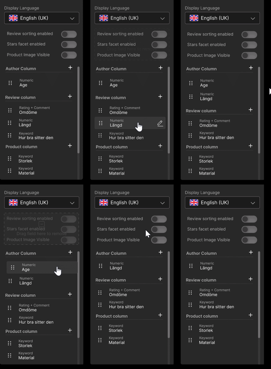
Drag-and-drop reordering
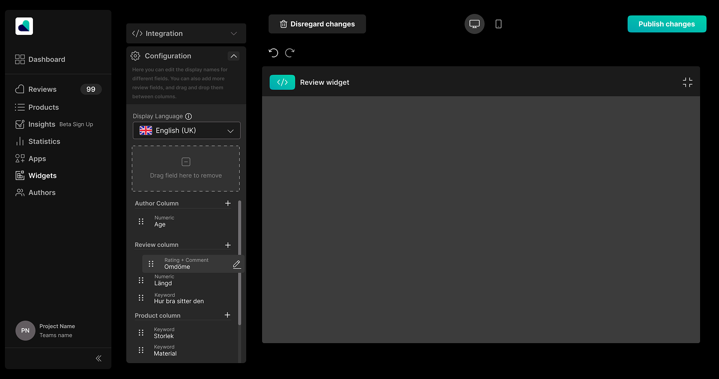
Drag-and-drop functionality was introduced for reorganizing fields between columns.
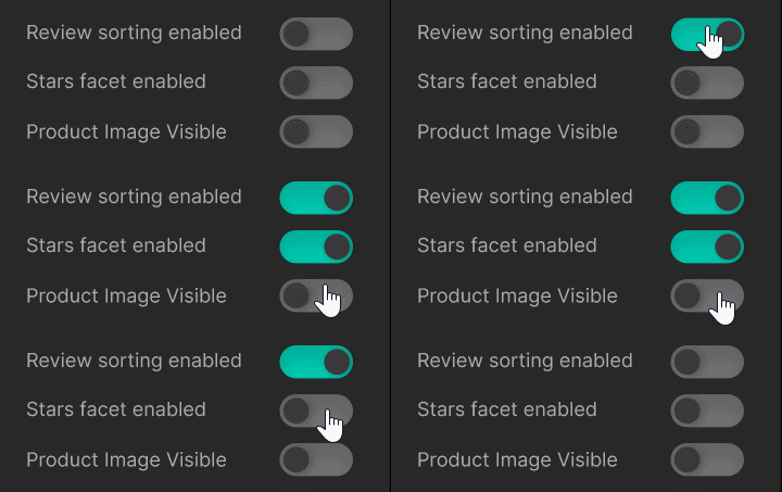
Toggle switches
Toggle switches were used for enabling and disabling review features such as review sorting, stars facet, and product image visibility.
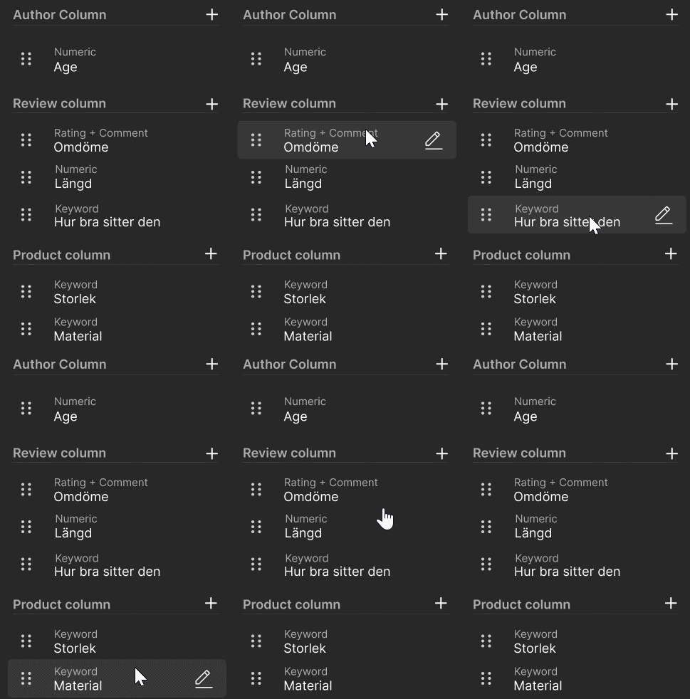
Hover states and feedback
The system also included hover states, visual feedback, warnings, and contextual editing.
DELIVER
Final Prototype
The project resulted in a high-fidelity interactive prototype for the configuration section of Tycka’s widget editor.
The solution allows users to:
- structure review information
- customize visible fields
- reorder content
- manage review layouts
- configure review functionality
- support multiple languages
while maintaining clarity within a feature-rich system.
The final prototype was continuously refined through collaboration and feedback sessions with Distancify throughout the project.
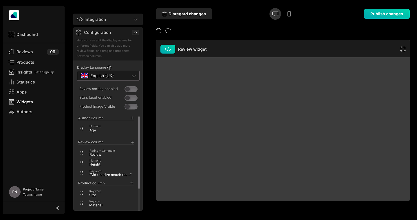
Configuration landing view
The configuration interface was designed around a clear column structure, allowing users to organize review data while maintaining an overview of how the final widget will appear (not yet designed). The sidebar mirrors the structure of the review widget itself, helping users understand the relationship between configuration and output.
Add fields modal
To manage large amounts of configurable data without overwhelming the interface, additional review fields are handled through a dedicated modal. This allows users to browse, search, and organize available fields while keeping the main configuration view visually clean and focused.
Drag-and-drop interaction
Fields can be reordered through drag-and-drop interactions, allowing users to structure review content in a way that matches their website layout. Visual feedback and familiar interaction patterns were used to make the functionality intuitive, even for users with limited technical experience.
Edit display name modal
Instead of editing field names directly in the main interface, a dedicated modal was introduced to reduce visual clutter and cognitive load. The modal provides contextual information about the original review question while allowing users to define shorter and more suitable display names for the final widget.
Reflection
This project taught me how challenging it can be to design for flexibility without creating cognitive overload.
One of the biggest learnings was that complexity in a system should not necessarily be removed, but structured. Instead of hiding advanced functionality, the goal became helping users understand relationships between actions, data, and outcomes.
I also learned how important system thinking is in UX design. Designing this interface required understanding not only what users see, but also how information flows through the platform and how technical constraints shape interaction possibilities.
Another important takeaway was the value of iteration. Early low-fidelity exploration helped reveal structural problems long before visual design decisions became important.
Working closely with an external company also gave me valuable experience in presenting ideas, discussing trade-offs, and adapting design decisions based on technical and business requirements.